Art


A Very Very Small Book

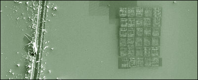
In a sterling attempt to redefine the concept of light reading, Robert Chaplin at the Nano Imaging Facility of Simon Fraser University recently created the smallest book in the world by using a using a focused-gallium-ion beam to ‘carve’ the letters of a story in silicon at a resolution of 40 nanometers*. The tale Mr Chaplin chose for this escapade is written by Malcom Douglas Chaplin who I guess we can presume to be related. It concerns ‘Teeny Ted from Turnip Town’ and his successful entry in the local Turnip contest. You can read all about Teeny Ted’s exploits with the aid of your handy electron microscope and still have time to apply another coat of Powdery Mist to the wainscotting before tea.

Robert even has a blog where you can read more about his creation and congratulate him personally (I love the web!).

Anyway, this whole episode prompted me to thinking that Teeny Ted is just the foot-in-the-door for the new shelfspace-saving Nano Book phenomenon that is certainly upon us. Obviously, a great place to start would be re-releasing the Classics in Teensy Tiny form. Of course their content would need to be diminished in some way to be more in keeping with the format.

It will not surprise you to learn that I have a few suggestions…

•A Tale of One City

•Lesser Expectations

•20 Leagues Under the Sea

•Gone with the Breeze

•Disagreement of the Worlds

•A Clockwork Cumquat

•Even Littler Women

•The Insignificant Gatsby

•The Old Man and the Condensation

I daresay my faithful readers will have more…

Special Cow Announcement: Moo! Oh, sorry, I mean: Owing to the high calibre of suggestions so far for Condensed Version Classics to be etched at nano scale, I have decided to award a prize to the entry that makes me laugh the most. It will be a proper prize mailed out in the actual Real World Snail Mail.

Judge’s (ie my) decision will be final and no correspondence will be entered into. I’ve always wanted to be able to say that. I’ve also always wanted to say Damn the torpedoes and full steam ahead!! but so far no proper opportunity has presented itself. Maybe somewhere in the next year’s worth of posts…

Ascendancies Cover

A new anthology of short stories from onetime ‘cyberpunk'[tippy title=”¹”]I’m sure he really hates that term these days…[/tippy] science fiction writer and green design visionary Bruce Sterling is due to be released by Subterranean Press this September.

Anything from Bruce is well worth reading, but the very special thing about this particular book (well, as far as I’m concerned anyway) is that the cover features one of my mathematically articulated images.

This image, called Red Portal is from my Complex Systems #1 inventions.

You can read a little more about my images, how they are made, and the creative philosophies behind them in this post, and see my galleries here.

Congratulations Bruce!

___________________________________________________________________________

¹I’m sure he really hates that term these days…

___________________________________________________________________________

Stones Against the Sky

I know you have all been waiting breathlessly for the second stop in the Bad Public Art Tour of Sydney and I don’t think you’ll be disappointed as we pull over here in Kings Cross just east of the city centre. Cameras on the ready?

This nine year old piece is one of the more controversial on our tour, and the controversy continues even to this day. Unveiled in 1998 to howls of outrage, sculptor Ken Unsworth’s ‘Stones Against the Sky’ quickly earned the alternative title ‘Poo On Sticks’.

There’s no getting around it. This is a monumentally ugly sculpture. If you have some idea of Unsworth’s other work, you can see what the general object was, but it has to be said that here he has failed spectacularly. In Unsworth’s defense, there was evidently an original plan for the sculpture to be sited among straight-trunked trees, and perhaps that might have mitigated the awful spectacle somewhat. Outside that context, however, it is one of the city’s more miserable artistic tragedies.

I have to admit that I am in general a big admirer of Unsworth’s work. He makes art that is whimsical, challenging and humorous and I would place him halfway along a sliding scale between Andy Goldsworthy and Len Lye. His wonderful ‘Suspended Stone Circle II’, in permanent exhibition at the Art Gallery of New South Wales, is a delightful achievement, and the illusion of the weightlessness of its large smooth river stones is at once impressive and charming.

Sadly though, ‘Poo On Sticks’ is likely to be the most widely encountered of Ken Unsworth’s creations, situated as it is in one of Sydney’s busiest centres. As I mentioned, the controversy over the piece continues. It has in recent times come under threat of urban terrorism ((A group of art students calling themselves the Revolutionary Council for the Removal of Bad Art in Public Places threatened to destroy the work. And no – I am not affiliated with this movement…)) and not too long ago it was clandestinely, and, I believe, with no consultation with the artist, given a drab coat of slate-grey paint (admittedly this does have the effect of removing the resemblance to big lumps of excrement, the boulders having been originally painted a shade of turd brown, but it does absolutely nothing to ameliorate the hideousness).

The moral to this story – when creating works for public display first ask yourself this question: “On a scale of 1 to 10, how close is my work to the physical resemblance of bodily waste?”

If you’re pushing 6, start again.

___________________________________________________________________________

Photographs ©Ginger Stick 2007 – thanks Cissy Strutt

Here in sunny Sydney we do a lot of things right. We have beautiful parks and gardens, stunning beaches, great restaurants and some inspiring architecture.

But there is one area in which we get it oh-so-conspicuously wrong. Bad wrong. Tragic wrong. Sad, sad, sad wrong.

Public Art. Sydney is really good at making really bad public art.

I find myself currently in the process of designing a public art work ((I say ‘public’ but I should clarify – my aural artwork will appear where only the very wealthy will experience it, but it is in a space that by proper definition is public. Anyone can hear it, if they can afford it…)) and my philosophical musings have ranged far and wide in an effort not to commit some of the same atrocities I have witnessed around me. As a consequence, I have amassed a sizeable collection of these artistic clunkers and, well, I feel duty bound not to keep the hoard to myself.

So Cow-o-philes, here begins a series of posts about the bad public art of the Harbour City. A kind of Bad Public Art Guided Tour of Sydney, if you will.

There is so much of this stuff that it’s hard to know where to start, so let me begin by introducing you to one of my local tragedies: The Garbage Bins of Newtown.

Slug Bin

I can’t actually recall the date that the plain trash bins along King Street were first clad in these appalling – I don’t even know what to call them – sculptures? I walk past them every day and I still can’t tell you what I’m meant to be gleaning from these works.

Closer Bin Slugs

Are those things slugs? Dog turds? Flatworms? As near as I can make out, they appear to be making their way out of the top of the bin to conglomerate in a wormy mass near the bottom:

Even more slugs

Seriously: what process went on in the artist’s brain?

Garbage bins. Newtown. Hmmm. Lots of dogs in Newtown. Dog turds. Garbage. Slimy. Attracts slugs. And flatworms. Yeah, flatworms. People on their way to work early in the morning. See garbage bins every day. Bright morning sun. Sleepy commuters getting ready for the day. Dog turds. Flatworms. Slugs.

Attached to some of the bins are little plaques with scrawly handwriting:

Bin Writing

… but this writing does not explain the slugs. In fact, even a quick perusal confirms that it is the ravings of a complete lunatic (which does put us some way down the path to an explanation, I guess…).

Now, I really hesitate to speculate on how much it cost to make these things, because I know it is going to make me feel even more nauseous than the dog turd/flatworm/slug motif. But they can’t have been cheap – the slugs themselves appear to be cast in bronze and inlaid in stainless steel sheets. There are four panels on each bin. About ten bins (maybe more). Plus, presumably, the artist was paid something for these (I’m in two minds about this – on the one hand I really hope for their sake it was a LOT because let’s face it, it’s not something they’re ever going to put on their resumé. On the other hand, I suppose I helped pay for this out of my taxes).

So, I am left with these weighty questions:

How can anyone have thought this was a good idea? Does anyone actually like these? Or am I the only one who’s ever noticed? Does the person on the council who commissioned them ever catch the bus first thing in the morning?

Google Maps reference for King St, Newtown, Australia.

The Pursuers

My one and only feature film appearance.

___________________________________________________________________________

I also wrote the music.

___________________________________________________________________________

Mmmmmmmm
And since we’re on the subject I feel obliged to bring this to the attention of Cow Readers.

Don’t go there if you’re squeamish. You have been warned.

___________________________________________________________________________

Thanks (if that’s the right word) boingboing!

___________________________________________________________________________

« Previous PageNext Page »