Sat 28 Sep 2013
When the Rubber Hits the Road
Posted by anaglyph under Art, Daft Advertising, Ooky, Sex, Travel
[16] Comments
Now that I live some distance south of the place where I spent most of my life, I find myself travelling a lot to visit friends & family and keep up with colleagues and contacts in the north. I sometimes fly, but if I have the time I like to take the drive. Driving is very relaxing for me – I get to chill out a bit, ruminate on the world and listen to all those podcasts for which I never seem to be able to find the time in my regular life.
Plus, I get to stop at truckstops for a bacon & egg roll and a chance to view the appalling, yet somehow grimly fascinating phenomenon which I call ‘Condom Art’
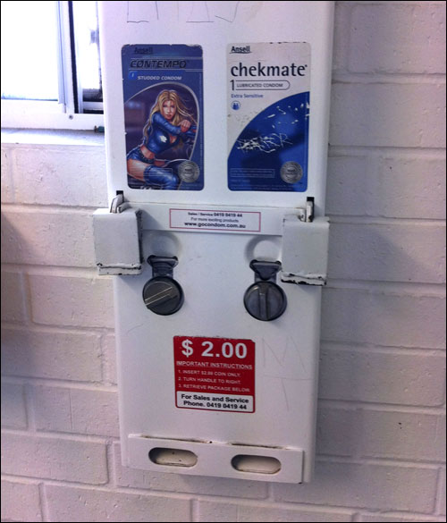
I don’t know if you ever see them anywhere other than truckstops (I never have) but the bathrooms always come equipped with a dispensing machine for condoms, and those machines are decorated with the most hideous advertising artwork known to humankind (and truly, that’s saying something).
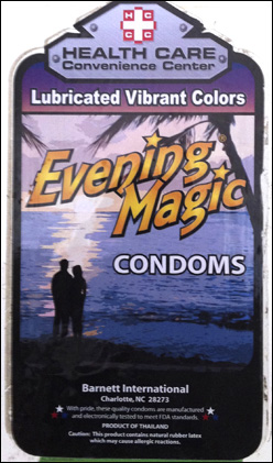
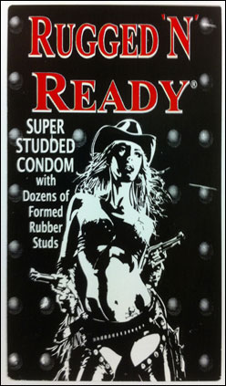
Ah, the sexual vistas promised by those images: the Evening Magic of a desert island tryst or wild Rugged ‘n Ready adventures with a windblown gun-totin’ bikini clad cowgirl. I can’t help but envy the dashing lives of the truckers that buy these colourful super-studded latex wonders.
But brace yourselves! I’ve started off tame, dear friends, because the night is young.
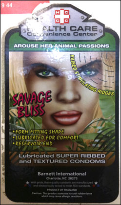

Maybe a dusky native seductress peering from the pandanus is more your style? Or perhaps a rough ridin’ tousled biker chick with thigh boots? Whatever the choice, make sure you throw some ‘texture’ in there!

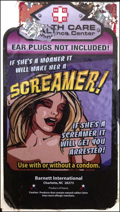
One thing I hadn’t known until I started paying attention to these artworks, is just how considerate truckers and travellers evidently are to their lady friends! It’s not just the ribbed condoms that your $2 will tempt from the machine: ‘Arouse her inner fire’ with ‘a ring of stimulating fingers’ promises Passion Plus! And prepare to be arrested for disturbing the peace if you use the Screamer (earplugs not included!). My goodness. I might have to sit down for a minute.
But my favourite by far has to be this:
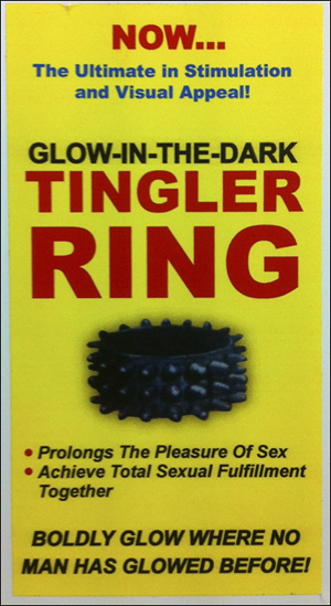
No aspirational promises there – just a formidable medieval-looking device on a strident bilious yellow field. In yer face truckers! Ah, I am joyful with glee at all the wonderful things in this ad. First of all it’s called The Tingler, which immediately conjures up all kinds of confronting images. ((Good advice from William Castle there: “Don’t be alarmed – you can protect yourself!”)) Then it has the advantage of being able to glow in the dark because… well then you won’t lose your way, right? And I don’t need to tell you that ‘Boldy glow where no man has glowed before’ is the very pinnacle of advertising slogan achievement, second only to ‘In space EVERYONE can hear a Screamer!’ (I seriously don’t know how they missed that one).
I am humbled in the face of genius.


 Other (please use your own words, or make a drawing):