Bad Sydney Art


Well Acowlytes, this is likely to be our last stop on the Bad Public Art Tour of Sydney, not because I’ve even come close to running out of Bad Art, but because, as I mentioned last post, I’m about to wave goodbye to The Harbour City and take up residence in The Paris of the South where the public art is of a different calibre altogether.

Today we head out west of Sydney toward the Blue Mountains. Have your cameras at the ready, because we’re on the freeway and will be (thankfully) passing this lame effort at speed.

Some Red Poles

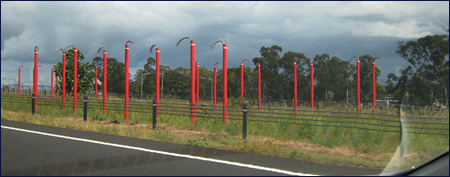
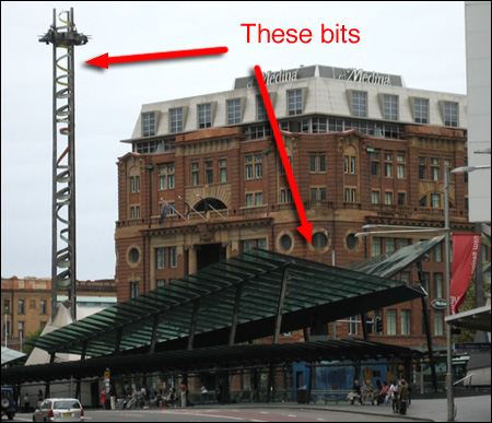
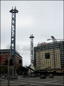
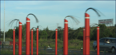
I used to drive past these red poles on my weekly trips to the Treehouse. For months I’d sail on by thinking ‘When are they going to finish those damn things?’.

The poles, painted in garish Road Safety Orange with wires sticking out the top, were obviously some kind of lighting fixtures awaiting a tardy electrician to turn up and complete the job. One day as I sped past the thought entered my head that… ‘Oooooo… they are finished. It’s some kind of artwork!’

And then, chuckling to myself at my silliness… ‘N-o-o-o-o… that couldn’t be right…’

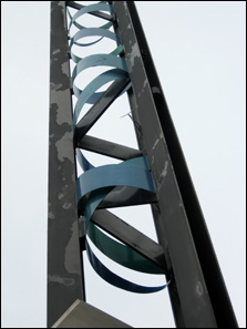
But it was. This is the Light Horse Interchange Sculpture Parade and those poles that look so much like a bunch of safety barricades on a bad hair day are in fact supposed to be symbolic of the horses and men of the Australian Light Horse regiments that served in France and The Middle East in the First World War.

This is how the effort is described on the Westlink M7 website:

Red, the colour of the Flanders poppy and poppies that bloomed throughout Palestine, is symbolic of the blood of supreme sacrifice and is the colour chosen for the sculptural group. The abstract plumage attached to each marker represents the emu plumes attached to the Light Horsemen’s slouch hats. The white band is a reference to the departing soldiers’ innocence of war.

Got that? Let me just rephrase it to clarify:

Crap. Crap. Crap crap crap crap crap crap crap crap crap crap crap crap crap crap crap crap crap crap crap crap crap crap crap crap crap crap crap crap. Crap.

First of all, the colour of the poles is not like any kind of blood I’ve ever seen, though at a stretch I guess you could say there are poppies that colour. Orange poppies. Secondly, the sculptor, whose identity I cannot find anywhere on the web (for obvious reasons, one has to speculate…) has evidently never seen an emu feather because they don’t look anything like bits of electrical wire. And aside from anything at else, the whole effect is just so completely pathetic. There’s no feeling of skill, or deliberation, or elegance, or challenge, or illumination, nor indeed any measure of art at all.

Some More Red Poles

I have a terrible sinking feeling, in fact, that there was no actual decent artist within cooee of this project, but that the bunch that designed the freeway – engineers from the Urban Planning Department of the Roads and Traffic Authority and urban design company Conybeare Morrison – appended a quick sketch for the ‘sculpture’ to the bottom of one of their blueprints for the engineering of the overpass construction.

It would help explain the appalling ‘artistic’ statement that I quoted above. It certainly wasn’t penned by anyone with artistic thoughtfulness because it’s so awful.

In a review in Architecture Australia, General Manager of the New South Wales Government Architects Office, Peter Mould, says of the work:

This is a strong theme for public art, but its execution is disappointing. It is artwork seen in passing, at speed, and calls for a robust scale so that the rhythm of the parade is legible. The feathers, too, are unconvincing.

And that, for me, says it all. It doesn’t even meet the standards of a Government architect.

___________________________________________________________________________

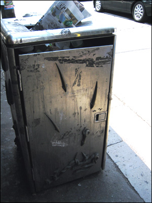
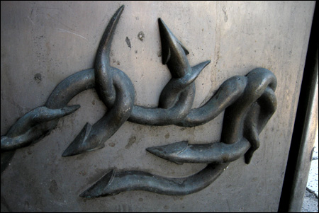
Thanks Alicia for Pic#1 and Violet Towne for Pic#2

___________________________________________________________________________

Railway Square Sydney

The next stop on our Bad Public Art Tour of Sydney takes in a combination of art and architecture, the sum of which truly amounts to a greater travesty than its parts. Feel free to aim your cameras at the 1999 makeover of Sydney’s major bus and rail interchange Railway Square.

The overall cost for this unmitigated disaster is variously quoted as $12 million or $20 million dollars. Either way it is money that could have been spent a lot better.

The government architects that won the tender for the job (let me guess – they were the cheapest…) have managed to effortlessly combine complete lack of utility with ugliness. This is no mean feat. (It’s not unusual to see one or the other – pretty but useless, or useful but hideous – but to manage both simultaneously takes a particular level of ineptness).

If you scrutinize the image above, you will immediately see one of the first problems you might encounter as a commuter seeking shelter under the bus shelter. Yes, that’s right. There is none. Even the mildest amount of rain manages to swish its way under the stupidly swept-up roofs of the thing, and if there’s any serious rain and/or wind, the elements are focussed in such a manner that you’d probably be better off standing on an unsheltered street. I speak from experience.

At the opening of the building, the government architect Chris Johnson ((Elsewhere the architecture is credited as “conceived by DPWS architect Margaret Petrykowski”. No-one is very happy to take responsibility for this mess.)) was questioned by a reporter about the lack of effectiveness of the shelter in inclement weather. He replied, bafflingly:

“During a strong southerly wind, there may be a problem with rain. But people have to walk through the rain from the home.”

Er… yes, Mr Johnson, so what you’re saying is, er, that since they’re already wet, then it doesn’t matter that the shelter is crap?

In the Hansard extract where that snippet of peculiar reasoning appears, The Hon. E. M. Obeid on behalf of the Minister for Public Works and Services declares:

“The weight of opinion is that this has been an excellent result, which has dramatically improved both the flow of buses and the amenity and facilities for commuters.”

Which begs the question: The weight of whose opinion, exactly? I’m thinking it’s not going to be the soggy people waiting in the wind-tunnel for their 20-minute-late bus.

Now if you’ll just follow me this way, I’ll ask you to turn your attention to the next feature of this work – the lighting towers. I use the word ‘lighting’ parenthetically. I don’t think I’ve ever actually seen the lights working. I know they must have at some time or other, because there are pictures of them illuminated. Most times I go past at night, however, they are just big dark gloomy junk-metal towers. The thought invariably comes into my mind that they will look exactly appropriate when the apocalypse comes.

Railway Square Sydney Railway Square Sydney

Aside from their lack of luminance, the other great feature of these radio-tower maquettes is the great shreds of coiled metal that spiral down their insides. It reminds me of nothing so much as a gargantuan replica of the mess you get if you tear up an aluminium soft-drink can.

The overall effect of the Railway Square edifice is one of complete industrial chaos. It’s as if someone rifled through a gigantic mechanical scrap heap and then dumped the lot in a pile. There is no thought of harmony at all, either within the creation itself, or with the surrounding environment.

To make matters worse, the structures are looking very shabby indeed now. The paint on the towers is peeling off, and the glass on the shelters is dirty and covered in bird shit. I don’t believe it has ever been cleaned. It’s not the way you’d expect to see something treated if you were proud of it.

Back in 1999, The Minister finished off his defense of the interchange revamp in parliament by opining through Mr Obeid:

“It is a clean and modern facility and one that, as time passes, will become accepted as not only an important transport interchange, but as a new gateway to the city.”

Well, Minister, time has indeed passed and I think that most of my fellow citizens and commuters would agree with me that after 8 years of practical interaction with this incarnation of Railway Square, it is not looked upon by us with even the remotest degree of fondness, and certainly not accepted as any ‘gateway to the city’. It is, at best, just barely tolerated.

Big Metal Flowers Painted Yellow

OK Cow-o-philes, on to Stop #3 on the Bad Public Art Tour of Sydney, in which we see how the citizens of Sydney support ‘The Arts’ with their hard-earned dollars.

This work was constructed some years ago in the Sydney district known as Darling Harbour. It’s hard to convey in a photograph exactly how cheap and daggy ((‘Daggy’ is a slang word peculiar to Australia and New Zealand which is something like a cross between ‘goofy’, ‘unfashionable’ and ’embarrassing’)) it is in actuality. Suffice to say that it is a blessing that it is hidden away in a place where few people will ever see it (fittingly flanked by an overpass and an IMAX theatre).

I have heard this piece referred to as a ‘flannel flower’ and I sincerely hope this is not what it is meant to be. This is what flannel flowers look like:

Flannel Flowers

Note the lack of vivid sickly yellow colour, and attend to the petal count.

I’m not really able to tell you much about this effort. A long search on the web has turned up nothing of value. Personally, I’d just as soon see the actual ‘artwork’ itself disappear into the same kind of obscurity.

Stones Against the Sky

I know you have all been waiting breathlessly for the second stop in the Bad Public Art Tour of Sydney and I don’t think you’ll be disappointed as we pull over here in Kings Cross just east of the city centre. Cameras on the ready?

This nine year old piece is one of the more controversial on our tour, and the controversy continues even to this day. Unveiled in 1998 to howls of outrage, sculptor Ken Unsworth’s ‘Stones Against the Sky’ quickly earned the alternative title ‘Poo On Sticks’.

There’s no getting around it. This is a monumentally ugly sculpture. If you have some idea of Unsworth’s other work, you can see what the general object was, but it has to be said that here he has failed spectacularly. In Unsworth’s defense, there was evidently an original plan for the sculpture to be sited among straight-trunked trees, and perhaps that might have mitigated the awful spectacle somewhat. Outside that context, however, it is one of the city’s more miserable artistic tragedies.

I have to admit that I am in general a big admirer of Unsworth’s work. He makes art that is whimsical, challenging and humorous and I would place him halfway along a sliding scale between Andy Goldsworthy and Len Lye. His wonderful ‘Suspended Stone Circle II’, in permanent exhibition at the Art Gallery of New South Wales, is a delightful achievement, and the illusion of the weightlessness of its large smooth river stones is at once impressive and charming.

Sadly though, ‘Poo On Sticks’ is likely to be the most widely encountered of Ken Unsworth’s creations, situated as it is in one of Sydney’s busiest centres. As I mentioned, the controversy over the piece continues. It has in recent times come under threat of urban terrorism ((A group of art students calling themselves the Revolutionary Council for the Removal of Bad Art in Public Places threatened to destroy the work. And no – I am not affiliated with this movement…)) and not too long ago it was clandestinely, and, I believe, with no consultation with the artist, given a drab coat of slate-grey paint (admittedly this does have the effect of removing the resemblance to big lumps of excrement, the boulders having been originally painted a shade of turd brown, but it does absolutely nothing to ameliorate the hideousness).

The moral to this story – when creating works for public display first ask yourself this question: “On a scale of 1 to 10, how close is my work to the physical resemblance of bodily waste?”

If you’re pushing 6, start again.

___________________________________________________________________________

Photographs ©Ginger Stick 2007 – thanks Cissy Strutt

Here in sunny Sydney we do a lot of things right. We have beautiful parks and gardens, stunning beaches, great restaurants and some inspiring architecture.

But there is one area in which we get it oh-so-conspicuously wrong. Bad wrong. Tragic wrong. Sad, sad, sad wrong.

Public Art. Sydney is really good at making really bad public art.

I find myself currently in the process of designing a public art work ((I say ‘public’ but I should clarify – my aural artwork will appear where only the very wealthy will experience it, but it is in a space that by proper definition is public. Anyone can hear it, if they can afford it…)) and my philosophical musings have ranged far and wide in an effort not to commit some of the same atrocities I have witnessed around me. As a consequence, I have amassed a sizeable collection of these artistic clunkers and, well, I feel duty bound not to keep the hoard to myself.

So Cow-o-philes, here begins a series of posts about the bad public art of the Harbour City. A kind of Bad Public Art Guided Tour of Sydney, if you will.

There is so much of this stuff that it’s hard to know where to start, so let me begin by introducing you to one of my local tragedies: The Garbage Bins of Newtown.

Slug Bin

I can’t actually recall the date that the plain trash bins along King Street were first clad in these appalling – I don’t even know what to call them – sculptures? I walk past them every day and I still can’t tell you what I’m meant to be gleaning from these works.

Closer Bin Slugs

Are those things slugs? Dog turds? Flatworms? As near as I can make out, they appear to be making their way out of the top of the bin to conglomerate in a wormy mass near the bottom:

Even more slugs

Seriously: what process went on in the artist’s brain?

Garbage bins. Newtown. Hmmm. Lots of dogs in Newtown. Dog turds. Garbage. Slimy. Attracts slugs. And flatworms. Yeah, flatworms. People on their way to work early in the morning. See garbage bins every day. Bright morning sun. Sleepy commuters getting ready for the day. Dog turds. Flatworms. Slugs.

Attached to some of the bins are little plaques with scrawly handwriting:

Bin Writing

… but this writing does not explain the slugs. In fact, even a quick perusal confirms that it is the ravings of a complete lunatic (which does put us some way down the path to an explanation, I guess…).

Now, I really hesitate to speculate on how much it cost to make these things, because I know it is going to make me feel even more nauseous than the dog turd/flatworm/slug motif. But they can’t have been cheap – the slugs themselves appear to be cast in bronze and inlaid in stainless steel sheets. There are four panels on each bin. About ten bins (maybe more). Plus, presumably, the artist was paid something for these (I’m in two minds about this – on the one hand I really hope for their sake it was a LOT because let’s face it, it’s not something they’re ever going to put on their resumé. On the other hand, I suppose I helped pay for this out of my taxes).

So, I am left with these weighty questions:

How can anyone have thought this was a good idea? Does anyone actually like these? Or am I the only one who’s ever noticed? Does the person on the council who commissioned them ever catch the bus first thing in the morning?

Google Maps reference for King St, Newtown, Australia.